
This is the year that visual content takes over the world. I know you’ve heard that before, but now the time is right. Creating stunning visuals for your blog posts or marketing materials is easier than ever.
Plus, there are a ton of creative people out in the world making compelling visuals. And from what I’ve found while researching this article, people are craving visuals in 2019. Don’t believe me? Take a look at these 10 amazing visual content stats I’ve outlined below.
1. Roughly 80% of readers only skim online content
I’m guessing that you’re skimming this article right now. I don’t blame you for that. There’s only so much time in the day, and we all have become master skimmers to make ends meet.
According to a study from the Webdam, only about 20% of people actually read the content during an average visit. And of those people, only read about 28% of the content before bouncing.
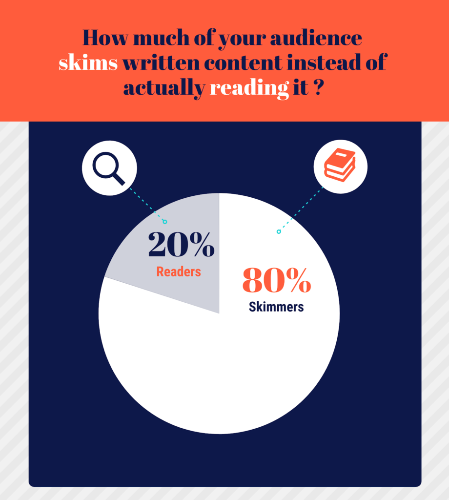
So, it’s safe to say people aren’t deeply processing most of your content.
I know this isn’t what writers want to hear. Being told that people are only barely reading your written content would definitely be a kick in the gut. But just because they skim through the first section of your post, that doesn’t mean they won’t read the rest of it.
Especially if they find an engaging visual, like the graph I used above or the image below:
At its core, this image is just an interesting statistic turned into a flashy graphic.
But these kinds of uncomplicated images can get people to stop in their tracks to learn more.
Which leads us nicely into our next section.
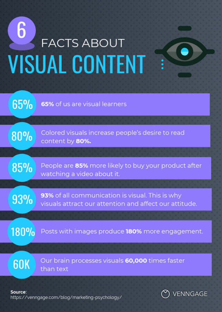
2. Visuals increase desire to read content by 80%
Because of this, sites such as Venngage, for example, will sometimes use over 200 images in a single post, such as in How to Summarize Information and Present it Visually.
I honestly think that article is successful because of the images. Can you imagine reading a list of 100+ tips without any visuals? You probably would skim a few examples, get bored, and then bounce in a minute. That’s because well-designed visuals actually increase people’s desire to read content by 80%. And articles with images every 100 words get 2x the shares of other articles.
Which would you rather read: a blog post that looks like a term paper, or one with a ton of visuals breaking up the written content?
The choice, in my opinion, is pretty easy.
Additionally, visual content allows writers to differentiate their content from the oversupply of content online. This makes communicating with their audience a lot more effective too, no matter the subject.
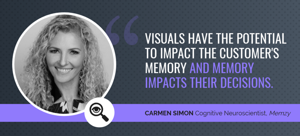
You will probably remember the quote above because I turned it into a colorful visual. You may even share it on social media because it’s interesting and self-contained. If that’s not a great illustration of exactly why you should use visuals, I don’t know what is.
3. 91% of people like visual content over written content
In the previous section, we saw that visuals increase the desire to read something by a significant amount.
However, I think there is a big difference between having to consume a piece of content and actually enjoying it.
When people consume content in 2019, they are going to expect some visuals.
According to a study republished by Forbes, “91% of consumers now prefer interactive and visual content over traditional, text-based or static media.”
This is a big deal for content creators, and the Forbes article itself is a perfect case study: It only used a single, vague stock image in the entire article about the power of visual content:
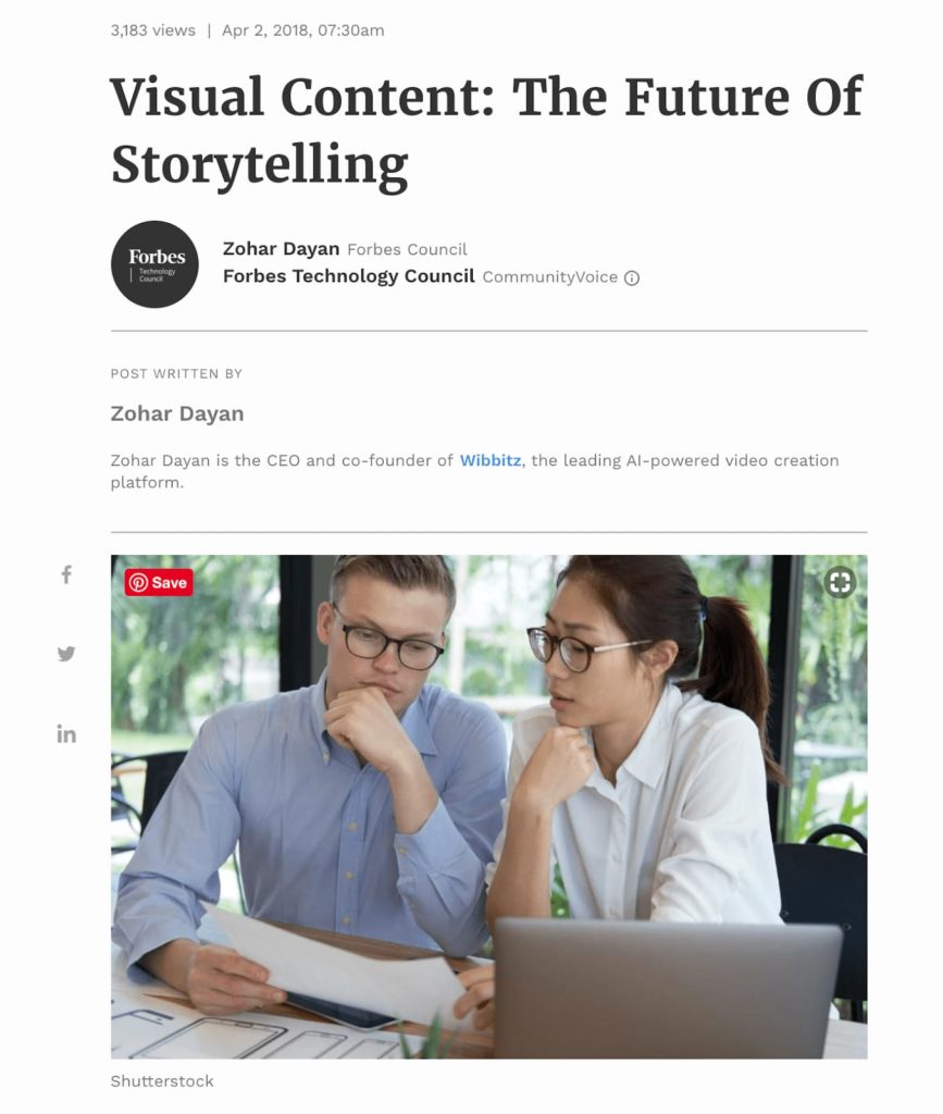
That is not going to cut it this year. Based on what we have learned above, readers are going to bounce almost immediately.
Additionally, there was no visual that made you want to share it on social media.
Both of these factors reflect in the view count above, with this article getting the same amount of views in a year that most articles get in a day or two:
Instead, they should have broken up the text with an engaging graph:
A useful visual quote:

Or even – and I hate to say this – a relevant stock photo:
Using any of these visuals, Forbes would have been more likely to hold the attention of readers throughout the entire article. The article has really good information, but it could have been presented in a more effective way.
4. People can follow instructions 323% better when visuals are used
If you have ever had to put together a piece of IKEA furniture, you already know how useful visuals are.
You might not have known that they help people follow instructions 323% better though.
Someone could tell you how to do something a hundred times and it still might not click. Strong visuals can do a better a job in a fraction of the time.
Here are a few ways to break down processes using visuals. Including simple screenshots:
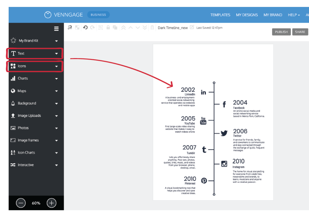
Video walkthroughs:
Annotated images:
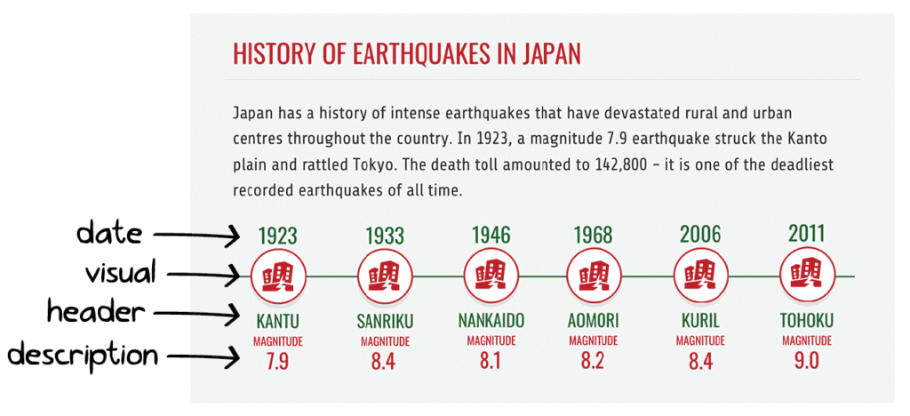
Explanatory diagrams:
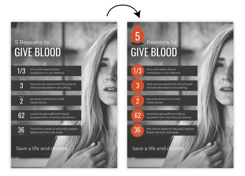
Or before-and-after images:
I’ve found that the articles that show readers how to do something, instead of telling them, perform exceptionally well. I see a boost in customer engagement when using visuals to send a message. That is why almost every article I write has a handful of these examples spread throughout the text.
Still not sold on using visuals?
Here are a few other stats that should help you convince your team to invest in visuals in 2019:
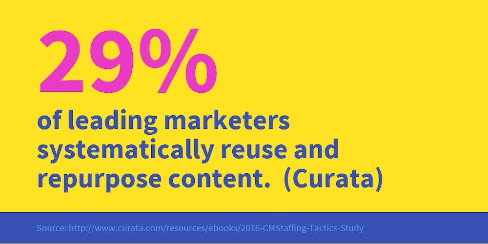
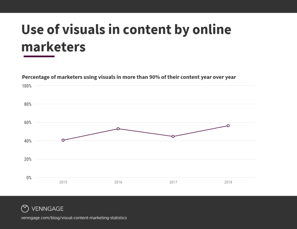
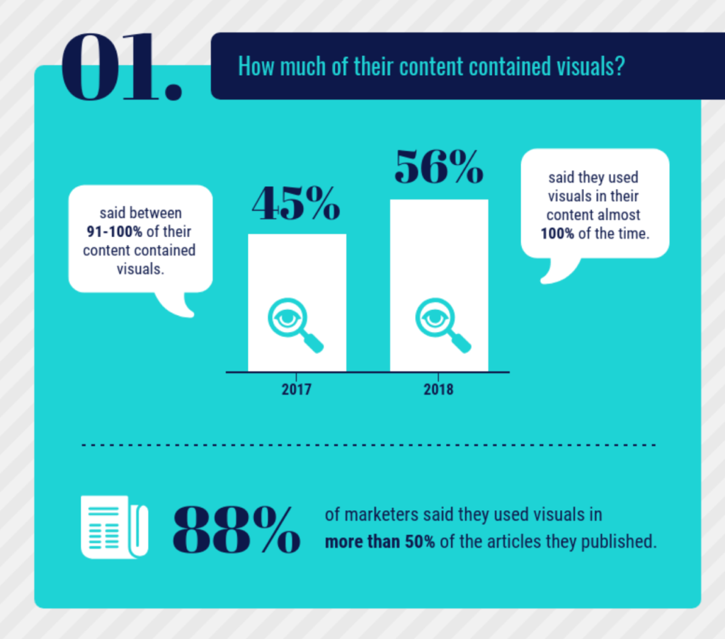
4. More than 55% of marketers use visuals in each of their blog posts
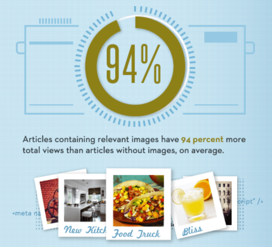
5. Articles with images get 94% more views on average
6. People can recall 65% of the visual content they see three days later
7. Our brain processes images 60,000x faster than text
8. Posts that include images produce 650% higher engagement than text-only posts
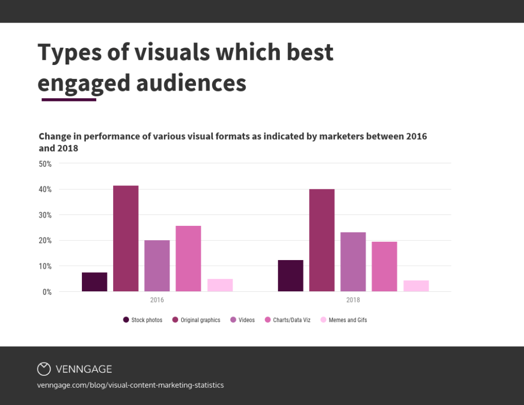
9. About 40% say that original graphics such as infographics and illustrations perform the best
And there you have it. Hopefully, you realize that visuals are the future of communications and start creating more of them in 2019.
Transform audience feedback into a live, animated word cloud created entirely within your presentation. You create the prompt. Poll Everywhere does the rest.