Updated poll chart technology delivers speed and high impact visuals

Our engineers recently rebuilt our multiple choice and ranking polls to use D3.js, which is the most powerful and flexible technology for generating data-driven graphics in web software. It is what underlies the most compelling graphics on the web, including the highly regarded New York Times visualizations. In contrast to many other libraries, D3.js allows great control over the final visual result.
D3.js wasn’t an option when we started live polling in 2007. But we constantly make changes to our code in order to remain at the cutting edge of responsive, attractive, and flexible live visualizations. When D3 debuted in 2011, we began watching it. Making the move was big and important and and it brought significant, immediate benefits to our users.
Faster poll charts
Poll Everywhere’s ranking and multiple-choice polls now load a whopping 12 – 15 times faster than before, giving presenters a more seamless polling experience. This time savings is a big deal to presenters who are on stage with an audience staring at them.
Clearer chart layout
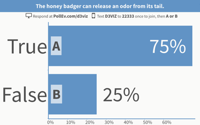
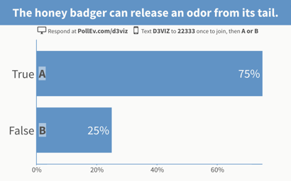
In addition, we also took this opportunity to make some subtle, but significant, changes to the layouts of these polls. As you can see from the side-by-side below, the new poll display places greater emphasis on the title text and poll chart. These are typically the two most important pieces of information for the audience.
Old poll chart visualization
New poll chart visualization
“Over the years, Poll Everywhere has seen SMS text responses decrease, and smartphone usage increase,” said project manager Brian Goodman. “That means, when people are responding to a poll, they’re likely viewing the answer choices on their device. Acknowledging this shift enabled us to adjust the layout of our poll charts to create a better overall experience.”
Of course, nearly everything about your poll – from the title to the response labels – can be manually resized if needed. This change only applies to how a poll looks by default. In fact, if you need to quickly resize a lot of text, there’s a new tool that lets you do that with a single click.
Single-click resizing of poll text
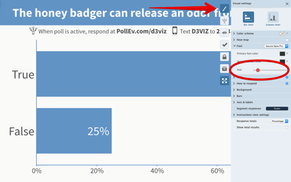
The new font size slider lets you quickly and easily adjust the size of all the text in your poll all in one place. Presenting on a small screen and want to ensure everything is legible? Just click and drag the slider until your text is the perfect fit.
You’ll find this slider by going to the visual settings menu and selecting font.
Showing the correct answer with any color scheme
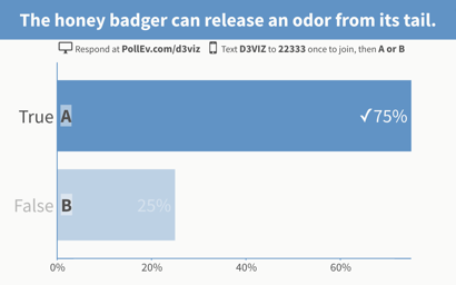
On certain plans, Poll Everywhere lets you designate an answer as correct when creating a poll. However, in some circumstances it’s difficult to tell which answer is marked.
“Previously we used a green checkmark and outline to visualize the correct answer,” said Goodman. “The new style increases accessibility, as well as harmonizes it with different branding and color schemes. This ensures the audience can easily see, via contrast, which answer is correct.”
Many teachers and educators use grading as a way quickly measure attendance during class, find out how to use Poll Everywhere for attendance.
Control over the color contrast of your keywords
This final upgrade is perhaps the smallest of the bunch – but as someone who takes a lot of Poll Everywhere glamor shots, it’s one I’m really stoked for.
You can now remove the highlight boxes around keywords. That’s right. Those little shaded boxes around the keywords on a bar graph – poof – you can take those right out.
It helps makes screenshots, such as the below, look a bit more stylish.
Each of these upgrades is completely optional as well; you can resize, adjust, and otherwise tweak your poll to your heart’s content. But if you just want to fire off a quick question and start engaging the audience, the information they need is now right at the forefront.
Happy polling!


