New visual designs for Activities create enhanced accessibility and modern elegance

We are thrilled to announce the launch of our newly redesigned activities! Our team has been working hard to modernize our activities and improve their appearance, all with the goal of helping you create engaging presentations that captivate your audience. Our new designs are sleeker, cleaner and brighter, making it easier than ever for you to create activities that stand out and attract your participants’ attention. Log in today to see these new designs!
.png?width=1515&height=942&name=Sara%20S.%20-%20Viz%20Revamp%20Blog%20Post%20(1).png)
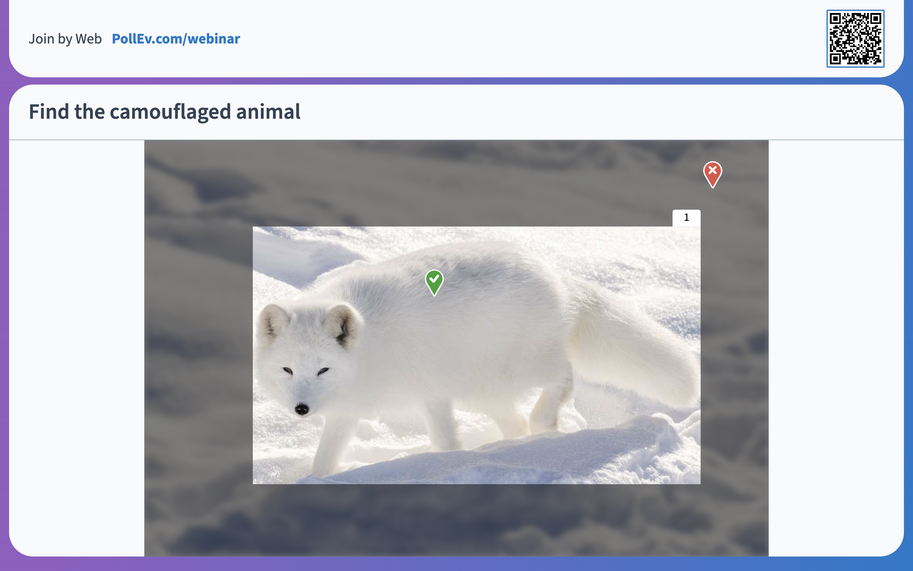
We’ve made activities more inclusive by addressing specific accessibility pain points. For example, we updated the correctness feature on Clickable Image so that correct answers are represented with a checkmark or an X, no longer relying solely on the marker’s color to indicate correct answers.

Along with this update, we introduced a new purple-blue gradient color theme called Modern that’s now available in your visual settings, in addition to our Classic blue theme.
Here are the main highlights of this release:
- ✅ QR codes are finally here! QR codes are now added by default to the joining instructions at the top of the activity screen. Participants have the option to easily scan the QR code with their mobile phone in order to join the activity.
- 🎨 Brighter colors that make your activity stand out: We updated our Classic color theme to a brighter blue background, and introduced a colorful new Modern theme with a captivating gradient blue and purple background. Both color theme options are now available in your visual settings.
- 🧹 Cleaner designs for bar charts, Q&A and more! Multiple Choice activities are now sleeker and easier to read. In Q&A activities, the thumb icons for upvote and downvote responses are now seen below the answer. They have also been grouped next to each other so that participants can more easily see the results.
Important Bug Fixes
- Line breaks, italics and other HTML tags are now fully functional in activity titles for Competitions
- Competition scores are now calculating correctly based on participants’ response time
- Scaling for poll response options has been fixed so that longer answer options adjust to the screen properly
- Ranking activities have been fixed to ensure that image answer options are visible
- Fixed timer activation when lock and unlock are indicated
- Instructor activity flows inserted into Google slides have been fixed to no longer display like Engagement flows