
Presenting data means accepting some hard truths.
Not every presentation is a TED Talk. You’re not Edward Tufte, and I’m not Nancy Duarte. We rarely get to create a stylized presentation that’s high concept and low detail.
Instead, you spend days (weeks? months?) pulling numbers and running analyses that must fit into a 30-minute presentation for an audience that has little idea what you’ve done. How are you supposed to communicate your findings in a succinct, but compelling, way?
Data presentation is a skill – one I’ve honed through years of practice. The techniques I’ve developed will help you maximize the impact of your data. Anyone can show a slide full of charts and numbers. A great presenter will explain their findings in a way that captures attention and fosters understanding. They help people internalize why the data matters.
After discussing these data presentation techniques, I’ll cover a data slide I’ve presented in the past. We’ll see what made that slide effective and close with some general advice.
How to organize any data slide
Data is the least important part of the slide. Support it with conclusions.
A graph is first and foremost a picture. Before your brain can parse the meaning of the graph, it recognizes it as an image. There are basic principles of composition you can use to guide the viewer towards important information.
These include using background highlights to focus on important data points, using the color red to guide attention towards certain parts of the graph, and arranging data so that progress is showing moving up and to the right. But the graph is not the whole story. It is only a piece of the larger narrative you’re presenting.
A graph is only as valuable as the conclusion(s) it reveals.
Conclusions are actionable. That’s why we’re going to surround our graph with them. The graph itself is simply the proof that supports these conclusions. The audience shouldn’t even focus on it. They should take it as fact, and concentrate on what the graph is saying.
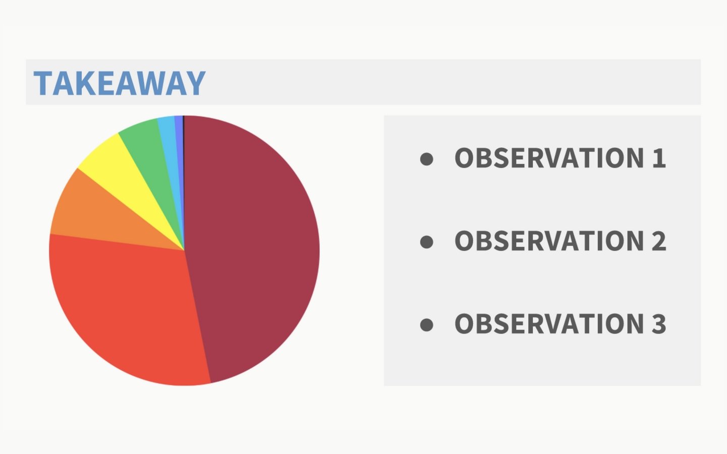
Take a look at the example slide above. This is my basic template for any sort of data presentation. There are three parts: Takeaway, Data, and Observations.
1. Takeaway: This is the most important piece of the puzzle. If your audience remembers one thing from your data presentation, it should be this. Try to sum up this point as succinctly as possible. This is what the data means.
2. Data: A great presenter takes the burden of comprehending all this data off the audience. You explain just enough so that everyone understands how you arrived at your Takeaway and Observations.
3. Observations: Don’t put anything here that isn’t observable from the chart. These are points of interest. Noteable. Maybe they help explain the Takeaway; maybe they’re just interesting observations.
Of course, visuals are only half the battle. You also have to discuss what you’re presenting. Don’t worry, I cover exactly what to say in the next section.
How to present your data slide
Talk through how to read the data, then focus primarily on what the data means.
It’s rare that the audience needs to understand every single data point in your graph.
That’s your job. You should know the data inside and out. You’re not just offering it up wholesale – you’re curating it. Doing so gives you an opinion on what the data means, and why it is important. That opinion is what you share with the audience.
What to say before your data slide
A presentation lives or dies by its transitions. Your transition into the data slide is more important than the slide itself. You have to nail it.
One of my favorite transitions is to give some context on the “Why” and “How” of my data slide. Why did I collect this data? How did I do it? Set up the problem your data will solve, then show that data – problem and solution. This setup gives the audience the tools they need to fully appreciate what you’re about to show them.
What to say about your data slide
Once you’ve established the problem your data is going to solve, it’s time for the big reveal. Present your data slide and say… nothing. Just let the audience absorb the information for about 10 seconds. That way, they’re not attempting to read the slide and listen to you all at once.
After that, you want to do four things:
1. State the Takeaway. The most important part. Summarize the data into a single point. What does it reveal?
2. Explain the layout of your chart. Help orient the audience. What do the axis represent? What trends are there?
3. Discuss one or two data points. This subtly trains the audience on how to interpret the rest (on their own time).
4. Finish with Observations. Could be suggested next steps based on findings, or explanations of outliers.
Even though you’re only speaking to one or two data points, you should be prepared to discuss them all – just in case. Part of the purpose of this presentation is to prove to the audience that you’ve done your homework. You know that data, including any outliers, and are ready to speak to any of them should someone ask.
Example slide from a data presentation
As the presenter, you are a storyteller. Take the audience on a journey
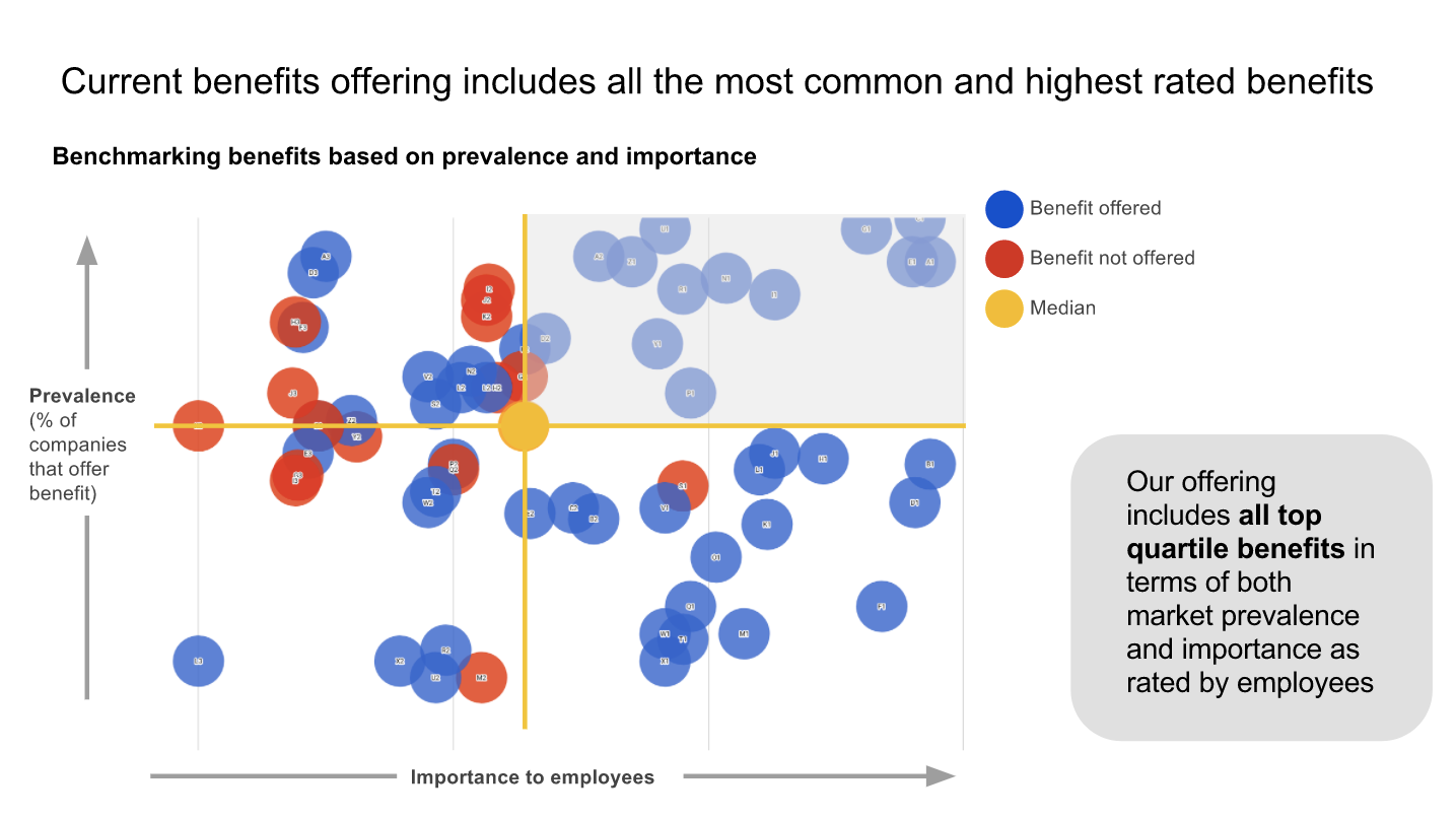
Above is an example slide from a data presentation our team gave. The topic of the presentation was employee benefits. Poll Everywhere’s operations team wanted to check for opportunities to improve our benefits package with an eye towards efficiency, recruiting, and retention.
As you can see, the data is pretty dense. I knew the audience could easily get distracted by all the bubbles. So, the first thing I did was state the Takeaway. This brought everyone back to what was most important.
Next, I said, “Let me orient you to what you’re seeing.” I walked over to the chart and introduced both axis. Then I pointed out how the bubbles in the top-right represented benefits that were the most prevalent in the market and desirable to our employees. To drive that point home, I also called out the lone bubble in the bottom-left as being the total opposite. These two explanations enabled the audience to navigate the rest of the chart on their own.
Finally, I used that Observation about reducing spending to transition to the next slide. There I outlined my suggested next steps for the company based on this data.
For me, giving a data presentation feels like telling a story. A decent storyteller won’t dump their entire narrative on you like a child’s book report. They take you on a journey. The story unfolds methodically so you can comprehend, and appreciate, the deeper meaning within.
Data presentation has a deeper meaning too. Don’t lose it between the numbers. Walk the audience through the data, and guide them towards the same conclusion you reached.