How Poll Everywhere used customer feedback to launch its new Organization system
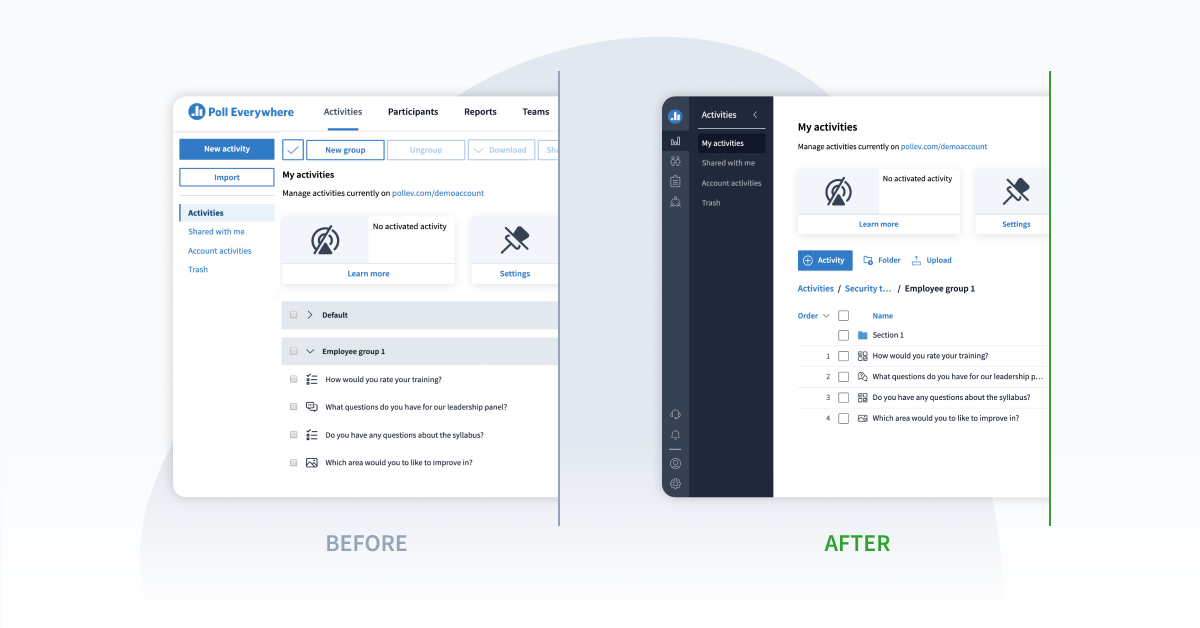
In the year of 2010 the iPad was released, Lost was a hit TV show with an exciting finale, and Poll Everywhere released the ability to Group polls into groups. Similar to the iPad, organizing polling activities into groups was very well received and resolved many customers’ pain points with organizing activities. And, similar to that Lost finale…it was underwhelming, and we were shortly thereafter asked to put groups into groups for deeper levels of organization.
A few years later, a bright and young-faced Product Manager looked through Poll Everywhere’s Uservoice Feedback forum, a place to review and attend to common customer requests. One kept popping up: a request for nesting folders inside of folders within the product.
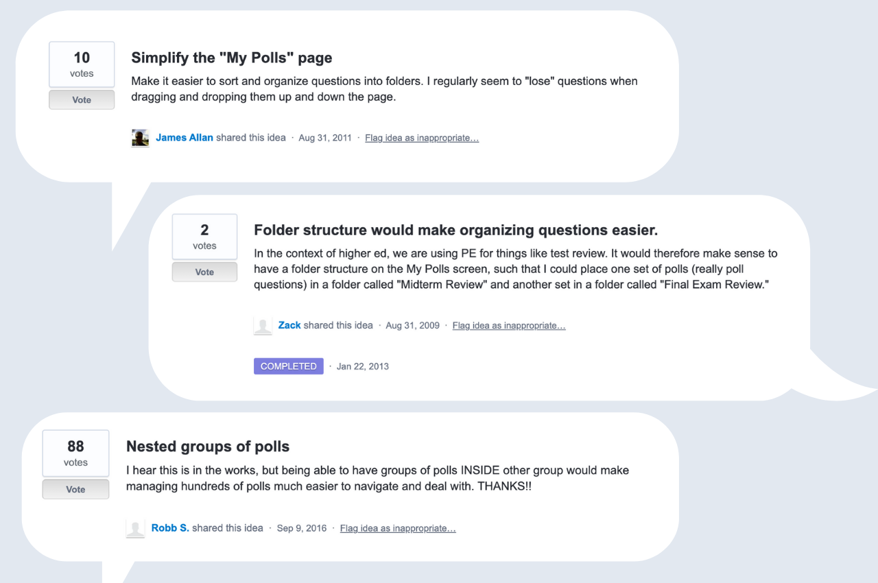
From there, the wide-eyed and innocent Product Manager decided to surface this wonderful and seemingly simple request to the engineering team, in hopes of instigating a quick fix that would save the day. He soon discovered this hope was far from reality. He was met with responses like “folders is going to be very hard,” and “the database model isn’t built for that – it’ll need to be rearchitected,” and “well, we’d have to redesign the entire App to make that work.” Cue sad violin riff.
With a few more years, projects, and grey hairs, the now-bearded Sr. Product Manager went on a trip to Liverpool, England to meet with the UK User Group to demo new features and get customer feedback. Over the course of a few very nice days, a theme began to emerge. Similar to the football chants of “Liiiiiiiiverpooooool” in Anfield Stadium, “Fooooldersss!” was heard loud and clear across the UK User Group. These were some of our champion customers with hundreds and even thousands of polling activities. We became convinced that we would eventually have to do this, but the expected cost of the project was very high. And, after a similar year long project (Competitions) had just completed and we had already begun work on another year long investment (Shared Activities), we just didn’t have the appetite or resources for something large. Instead we focused on smaller feature requests with known ROI (Teams, Team Managers, Images in Open Ended Questions, Configurable Data Retention, Microsoft Teams integration and more).
Year-long projects begin very slowly and require a lot of buy-in and justification. We knew our customers wanted it, but we had to weigh this against many other requests. So the story continues.
The catalyst
On March 12, 2020, our now grizzled and grey Product Manager was watching basketball at our San Francisco office headquarters when something strange happened. All NBA games were suddenly canceled due to COVID-19. A few days later, we had a pandemic on our hands and the entire world changed.
Like all companies, a lot changed dramatically at Poll Everywhere. Far down the list of concerns, but still important, was “what does this do to our product roadmap?” We needed to make changes to work better asynchronously as a company, but also as a product heavily used in remote presentations. Companies across the globe were forced to implement remote work for the first time ever, and we had a product that would act as a solution for many newly-found pain points. We implemented numerous changes to adjust to our customers meetings, trainings, and events that were now held completely remote. We focused on reacting to the crisis, rolling up our sleeves, and providing a product that users could rely on during an incredibly scary time. We pivoted to quickly create more relevant features including a secure way to embed activities, asynchronous survey enhancements, a more seamless device experience, and Pinned Q&A activities. This was only the beginning.
With all of this reacting, we needed something to point towards as a larger goal. Something to assure ourselves and our customers that we were still investing for the future and a world after COVID-19. We asked ourselves: “what if we had a team actually do it? Change all of the UX for our main Activities page, change our most complicated database tables from a 1:1 relationship to a 1:many relationship. In short, what if we built Folders?” So, we began.
Learning the specifics
Folders is a “solved” problem. Everyone knows what a Folder is, but then there are plenty of specifics to keep in mind and question. We didn’t want to take anything for granted.
First, we began with a general market analysis across our customers’ commonly used applications and software to compare if and how they were offering folders or organizational features in some capacity. After all, there is no need to reinvent the wheel – just build the wheel people expect. We landed on Windows Explorer as our main UX inspiration, as it is by far the most used tool among all of our customers that has a File Organization system.
We then began several rounds of recorded, formal user interviews with our Customer Feedback Group via Zoom,and Figma design mocks of our earliest iterations. We leveraged Notion tables to track all the data for pattern recognition. This was followed by unique user tests through UsabilityHub to get feedback from those who have little to no context or prior experience surrounding Poll Everywhere. It’s important to balance feedback from power users with that of complete novices – that’s the only way to serve both!
We came away with a fairly stable design throughout and a long list of required features. That’s when the real work began.
Breaking the mega-project down to workable chunks
Large projects have a tendency to overwhelm your team, increase scope as more and more “requirements” arise, become massive refactors for design or engineering, and break seemingly unrelated parts of the application. We had buy-in for the project and enough customer requests to give us a large appetite to do it right, so we elected to sacrifice speed to ensure quality work and prevent burn out. We did this by breaking the project into six-week deliverables.
The stages:
- First, take care of our single biggest dependency: Surveys. In order to not break our Survey feature, we had to redesign it to ensure users can reorder their survey questions.
- Update our database so we can store multiple levels of Folders.
- Release Folders for desktop devices behind a beta-feature flag for testing and ensure backwards compatibility.
- Support all bulk actions and creating reports when there are multiple levels of subfolders.
- Drag and Drop support to reorder activities and support on mobile devices.
- Finally, add sorting functions for last modified at, count, and alphabetical + any remaining feedback.
For a project of this magnitude, we wanted a single source of truth for all of our documentation. However, we didn’t want to overwhelm the team with a near infinite list of tasks – particularly when we expected new things to arise as we received feedback. To balance these concerns, we used Notion to track each six-week project cycle and its Kanban board feature for individual tasks.
We would keep the same “Parent” document but create subpages for each six-week project with its own deliverable. Each project cycle also had its own Kanban board. At the end of each cycle, we had a two-week cooldown to let the team recharge, take care of any cleanup tasks, and let the PM, Design, and Team Lead plan out the next cycle in detail.
Learning and getting feedback throughout
Product updates like Folders require a flexible mind and the patience to not just accept, but to seek feedback from different people. The last thing you want is to pour significant sums of money over 16+ months and make a mistake because you were too arrogant and left blinders on your head.
Throughout summer 2020, we conducted user interviews with select groups of large accounts and power users to ensure we didn’t fall into that latter category mentioned above. We used Figma for our design mocks and to receive feedback from SMEs and our Customer Feedback Group. This saved us a lot of time and headache as we were able to revise assumptions before programming an entire application.
In January of 2021, we had a functional nested Folders structure for desktop, but many of our bulk actions and mobile support wasn’t there. To receive real-world feedback, we released Folders to a cohort of users (who opted-in) to test out our new Folders designs while collecting Product CSATs throughout the months.
Our designs and functionality changed pretty drastically based on the feedback we received. Some larger changes included extra emphasis on drag-n-drop support, the ability to add new bulk actions while keeping and maintaining existing ones, and finally adding a sorting capability to organize Folders by the most recently modified date.
A happy coincidence for a combination release
As we were building Folders we repeatedly encountered one explicit piece of feedback and one implicit issue. Explicitly, many of our users requested a way to sort or filter their new Folders by last modified date to quickly find the presentation/activities they were recently working on. Implicitly, our user tests within UsabilityHub showed that new users were spending more time searching for specific Folders and exploring navigational options than we anticipated. There were just too many distractions on the main Activities page and as users switched between different navigation menus and CTAs.
We didn’t feel it was right to continue improving one aspect of the product if something as large as this went unattended. With this feedback, we spun up a parallel project team to begin working on a new Information Architecture and Navigation menu within our applications. This was initially planned as a followup project to be released shortly after Folders, however, thanks to a few happy accidents, the fast iterations from our design team, and the foresight of our frontend architecture from years prior, this Navigation project was finished quicker than expected. It left us with an opportunity:what if we released all of our changes at once? What if we made one big changeover to introduce a whole new Organization System?
It’d take a little more work to coordinate, but would be a better customer experience. A better customer experience is always the objective. So,we went for it.
Final countdown: the big release
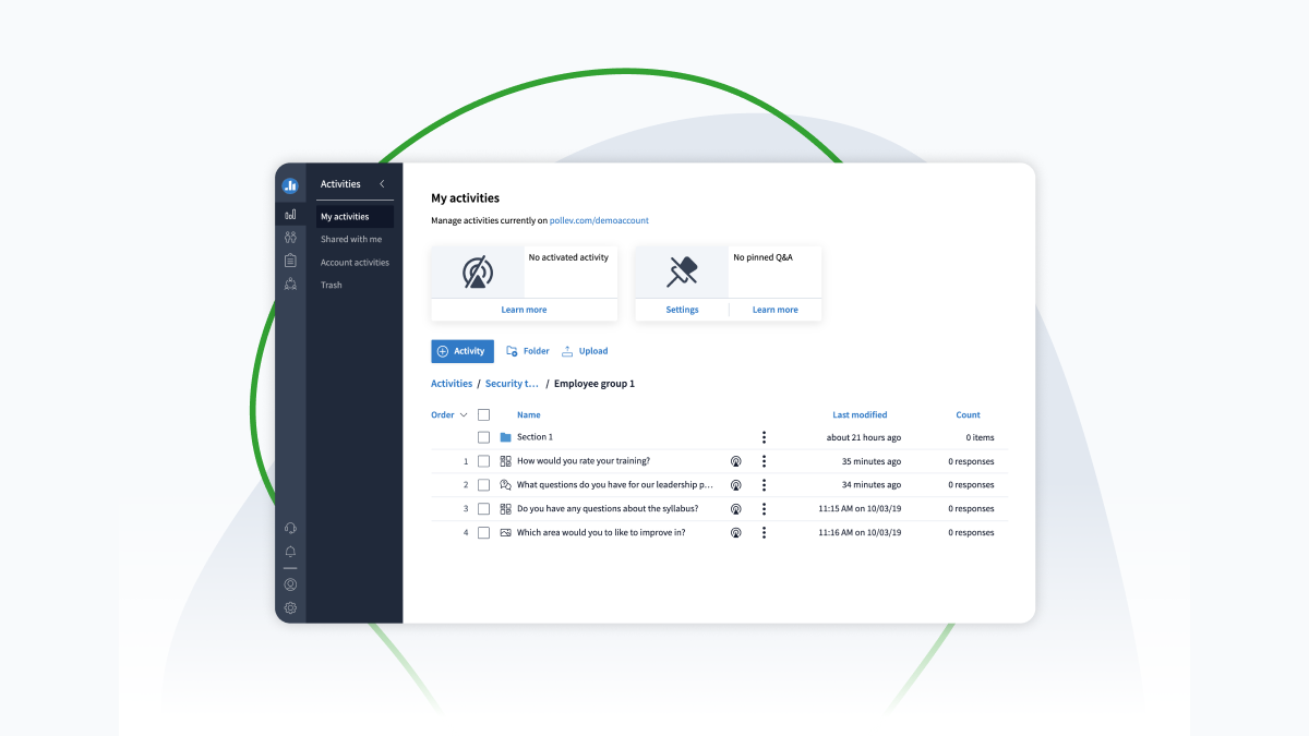
By the end of our Folders + Navigation projects, we had created and delivered a more functional way to organize activities without any significant loss in usability or support of previous features. Our CSAT scores from our beta testers had increased 20% to an acceptable 4.1/5 rating. However, we had a wide variety of small (2-3 day) feature requests and bugs that had been cut from scope from the previous six cycles. A laundry list of disparate tasks does not make a successful project. Our regular processes wouldn’t do. It was time to get creative.
We viewed this as an opportunity to energize the entire company. We gave a two-week cooldown for all product teams while our QA, Marketing, and PM leaders focused on creating a list of tasks in Asana to take us across the finish line. We chose Asana for its easy accessibility for both engineers & non-technical folks, subtasks feature which allowed for more granular breakdowns of deliverables, and the ability to rank order our task lists with due dates.
The entire company joined in on this final push. We updated all of our Support Articles, created a training course to introduce the new organization system to enterprise users, hosted an in-app tutorial, fixed all of our bugs, and polished the last couple features we released prior to Folders + Navigation. Following this all-hands-on-deck marathon, we finished the task list in its entirety. The final unicorn splashing across the Asana checklist will be cherished for many years.
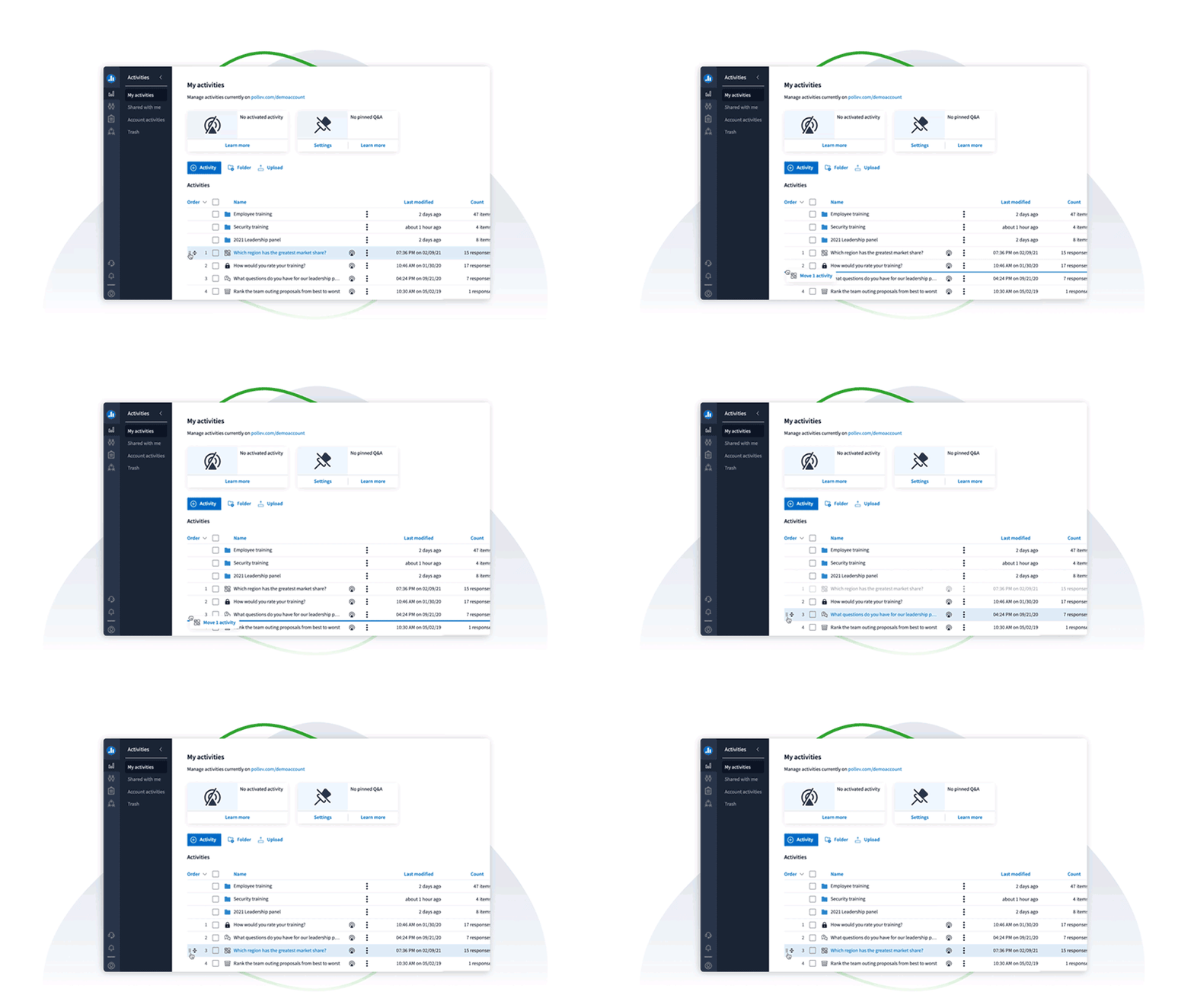
The wrap up
This is Poll Everywhere’s biggest project to date. Poll Everywhere customers have already made 25,000 new Folders since our launch date on June 15, 2021, and this number increases by about 600 every weekday. We won’t be resting on our laurels too much (although, a certain PM did take two weeks off snoozing by the pool before writing this blog). We’ll be releasing updated Presentation Controls,a new Activities Homepage, and much more in the upcoming months. Needless to say, we have momentum and don’t plan on stopping anytime soon. With our customers top of mind, we plan to be the household name of enterprise solutions for audience engagement…and then some.
Thank you all for joining us on this ride and bearing with us as we spent six years considering a feature and another two years building the thing. Like us, we hope you consider it was worth the wait. If you have product feedback that could spark the next major change in Poll Everywhere, please share your thoughts on Uservoice and our Product team will take a look!