8 ways to use interactive images in a presentation

Interactive images are a great way to capture and present audience feedback in one place.
The images can be maps, charts, smile sheets – anything you like. The audience clicks anywhere on the image, and a green pin plots their response.
Below are examples of how you can use interactive images in your own presentations. I made these examples using Poll Everywhere, an audience response system that lets you create and present questions that people respond to using their phones. You can embed Poll Everywhere image polls directly into PowerPoint, Google Slides, or Keynote – or present them from the web.
Map audience sentiment on a scatter chart
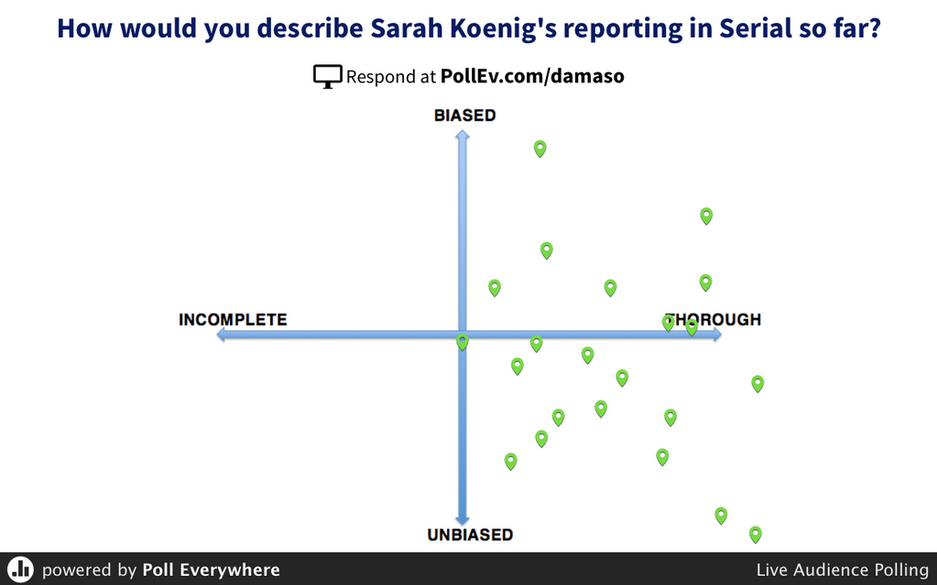
One of the best reasons to use an interactive image is scope. The audience can choose from a wider array of responses on a simple chart – such as the one below – than in a multiple-choice question. This example measures people’s feedback on the podcast Serial. It looks like everyone agrees that the show is thorough, but are split on whether it’s biased or not.
Use smile sheets for quick feedback
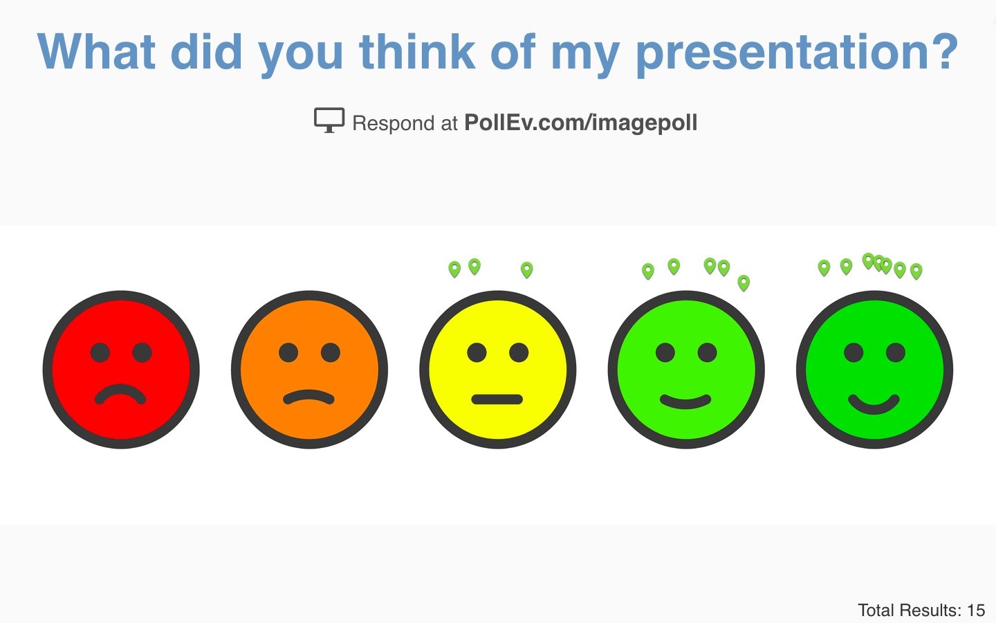
I’m sure we’ve all seen one of these before. The classic smile sheet is an audience feedback staple. The version below is from Poll Everywhere’s own image library. It pops up as an option when you create a clickable image poll. That means you don’t need to worry about hunting down your own smile sheet. There’s already one waiting for you in your account.
Create an interactive game using optical illusions
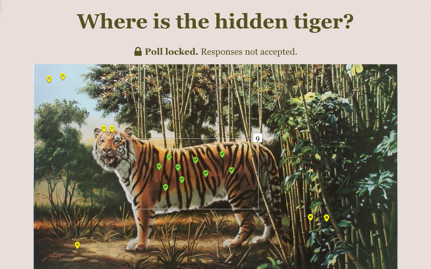
I mentioned this activity before in a post about interactive presentation games. It’s a fun little brain teaser you can play with the audience. Simply hunt down an optical illusion that poses a challenge to the viewer. For example: the Müller-Lyer illusion (Which line is longer?). Your poll then asks the viewer to “solve” the illusion by clicking somewhere on the image.
Collect feedback on different logos and designs
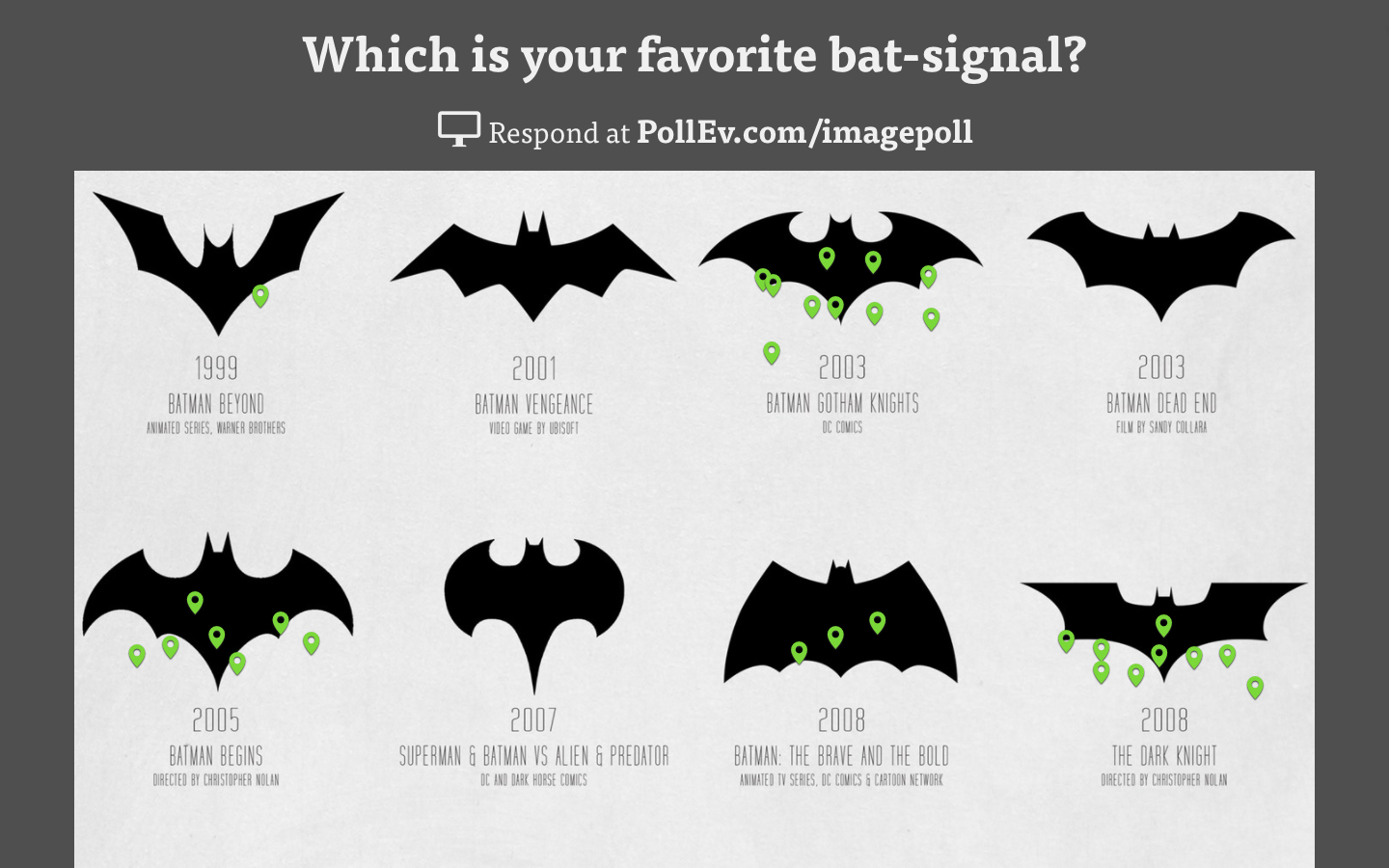
Array several iterations of a logo or other design in a grid and have the audience vote on which one they like best. You can set up the poll so that each person can respond once or multiple times. Just like in the Serial example, this poll demonstrates the breadth of response options a clickable image poll can support.
Transform images into interactive questions
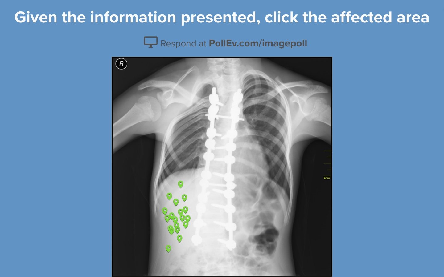
Dr. Vikas Shah, consultant radiologist at the University Hospitals of Leicester, uses clickable image polls to create interactive X-rays for his students. These questions ask students to identify where on the X-ray an abnormality is located. Specific sections of the image can be designated as correct so that students can be graded on their responses.
Repurpose images in fun, creative ways
Okay, this one is one of my favorites. It reimagines a Where’s Waldo puzzle by challenging viewers to identify something other than Waldo. Once you get the hang of creating interactive image polls, you’ll start sizing up all sorts of images as potential activities. Hitting the audience with something unexpected like this is a great way to pull them out of a stupor and re-engage them in your presentation.
Gauge the audience’s mood on a color spectrum
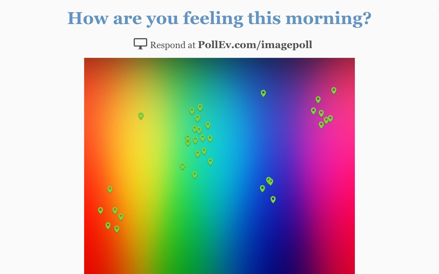
Sometimes it’s important to check in on the emotional well-being of the audience either before or after your presentation. A color spectrum, such as the one below, lets the audience respond in greater detail than a typical smile sheet or other one-to-five scale. It can also be reassuring for people in the audience to see that others are feeling the same way.
Use maps to make questions more relatable
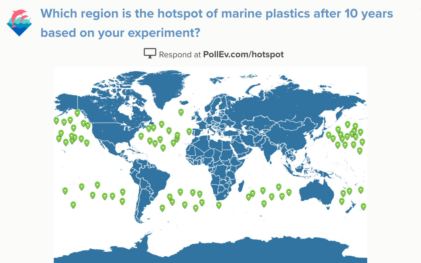
For my last example, here’s an interactive image from an environmental studies professor at the University of Washington. They used a word map as their clickable image, and asked students to plot the results of an experiment about marine plastic pollution. Visualizing the results this way helps drive home the fact that marine debris doesn’t just stay where it falls – it spreads out all over the place.
